We live in a time where competition is at its peak and competitors sees you as their rival. As a business, you have to brace yourselves and face the challenges with immense dedication.
With times, the way of communication has also changed. The Internet has offered us a platform to prominently interact with our clients and deliver our vision, mission, and messages more efficiently.
With millions of website available online, it’s crucial for you, as a business to establish a stellar identity. We at iTreeni are focused on delivering high-end & model-oriented websites to our clients by integrating dynamic designs and contemporary features. With years of combined experience in the industry, our experts are committed to designing a modern and user-friendly website for multifaceted companies across the world.
iTreeni adapts research-backed methodologies by harmonious synergizing skills and sophisticated technologies in our working process.
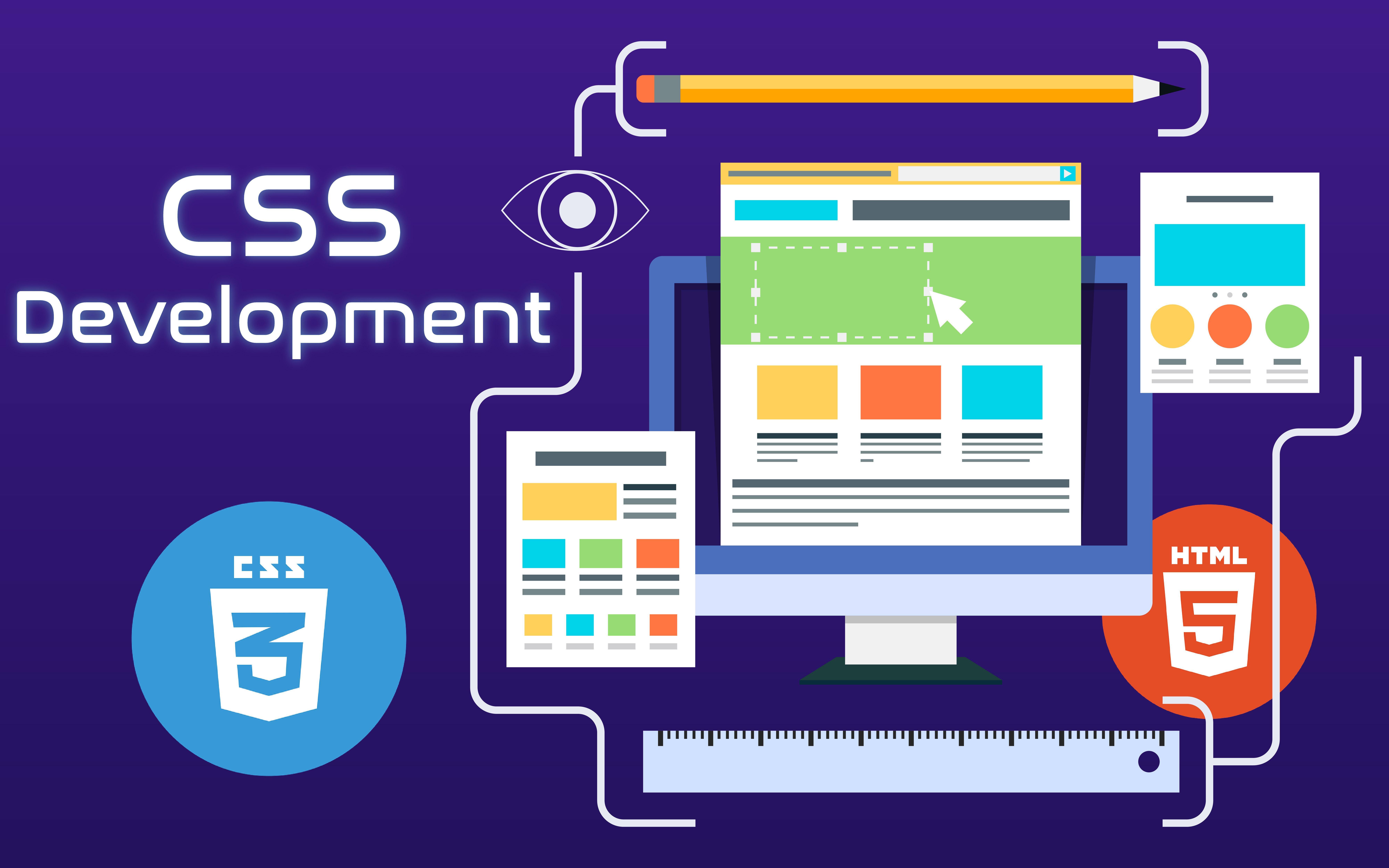
If HTML provides a foundation for a website, then CSS is what gives a website or app its flair and luster. Our designers at iTreeni leverage the essentiality of HTML and CSS for generating brilliant designs complying with the current market trend.
CSS: Acronym for Cascading Style Sheets offers visual and aural layout to websites and applications. As a popular visual language, it facilities seamless control to developers over graphics, scripting, background colors, navigation bars, fonts, text alignment, etc.
In short, when you open a website and fall in love with the design, then most probably it’s due to CSS.
CSS identifies itself as an ever-evolving visual language. The arrival of CSS3, which has indeed revolutionized web technology by introducing avant-garde features. Apart from allowing compatibility with previous versions of CSS, it has debugged all issues related to mobile development, Adobe Flash and device incompatibilities.
Why use CSS3?
| Mobile-friendly: | CSS3 supports media queries, allowing developers to build responsive designs providing indefectible adaptability with all screen sizes and resolutions. |
| Saves time: | As it runs on module-based code, one can easily edit – elements, backgrounds, borders, text effects, within a matter of seconds. |
| Lowers bounce rate: | Text is easily organized with features like text-overflow, work breaking and text wrapping. Hence, promoting customer interaction/ retention by displaying tidy and properly aligned contents. |
| Supports Specialized Fonts: | It eliminated the need for using generic web-safe fonts. With CSS3, you can captivate your users by using a wide range of special fonts. |
| Visually-rich Sites without compromising in loading pace: | Permits developers to create attractive 2D/3D animations, transitions and transformation without using complex JavaScripts or Flash. |
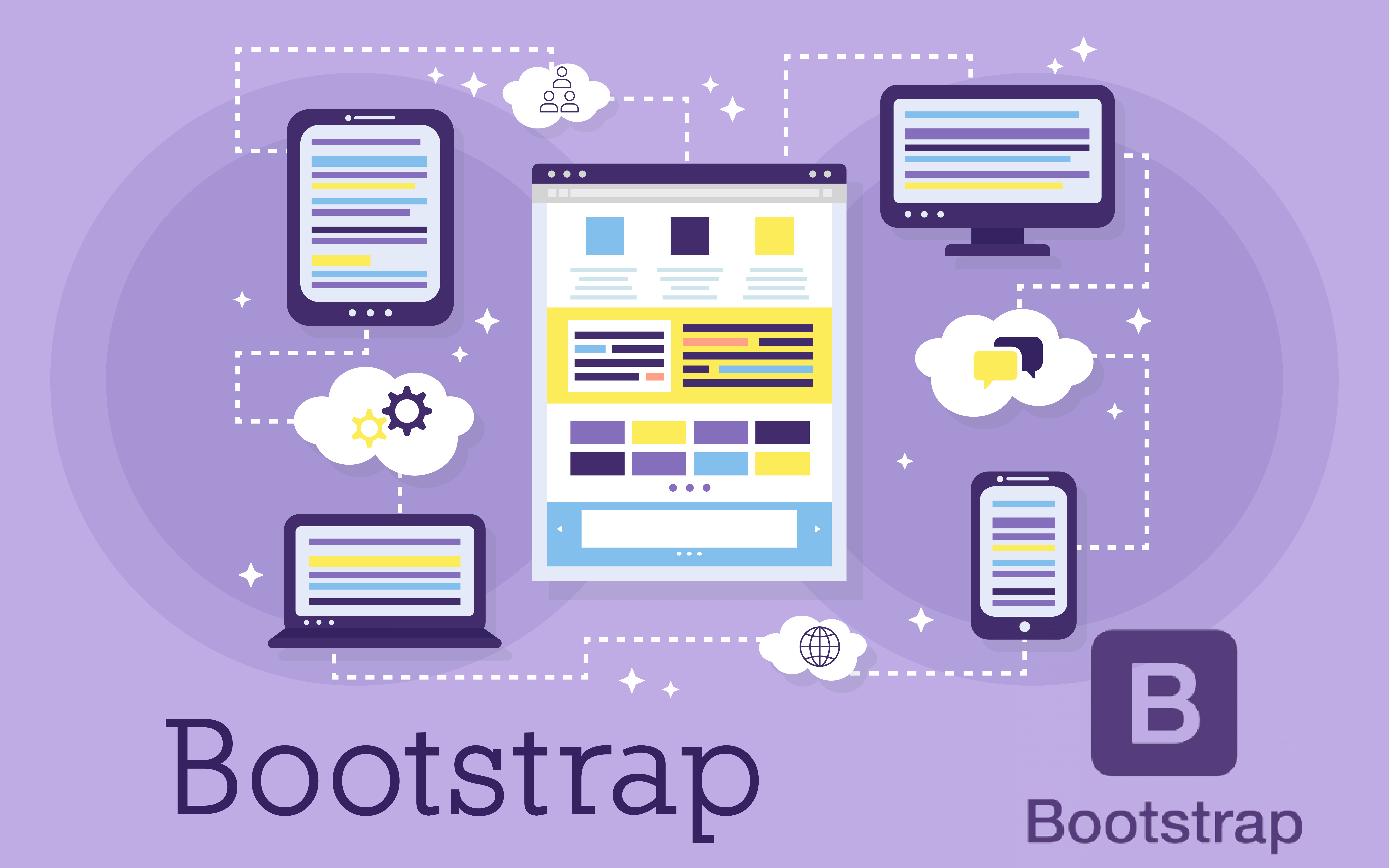
As a front-end framework, Bootstrap offers remarkable features for creating dynamic websites and web applications. Apart from its excellent compatibility with all popular browsers, it also encourages prompt development of fast-loading & responsive web pages.
Bootstrap comes packed with high-end HTML and CSS-based design templates including several interface components, allowing developers to keep up with modern trends. It seamlessly supports all latest version of browsers. It got potential to identify the characteristics of different devices and dynamically adjusts the layout of web pages accordingly.
Bootstrap is recognized among the most popular web designing frameworks. Its favorable features hold a great amount of respect among the designers’ and developers’ community. As hosted on GitHub, it facilitates symphonic collaboration and interactions between peers and users.
Why Bootstrap?
| Eliminates Redundancy: | It includes pre-built codes, eradicating the needs to structure code from scratch. It allows faster development by diminishing the time spent on coding, empowering designers more time to plan on other features. |
| Best for Mobiles: | The presence of responsive layouts and 12-column grid system accommodates the creation of responsive web designs for all devices. |
| Automatic Image Resizing: | It includes a predefined code for image resizing; allowing automatic resizing images based on the screen size. |
| Mesmerizing elements at your fingertips: | Make your webpage more captivating by instantly adding eye-popping elements like Navigation bars, Dropdowns, Progress bars, Thumbnails etc. |
| Reap the benefits of JQuery: | Supports one-click integration of JQuery, enabling you to extend your website’s interactivity with sophisticated features. |
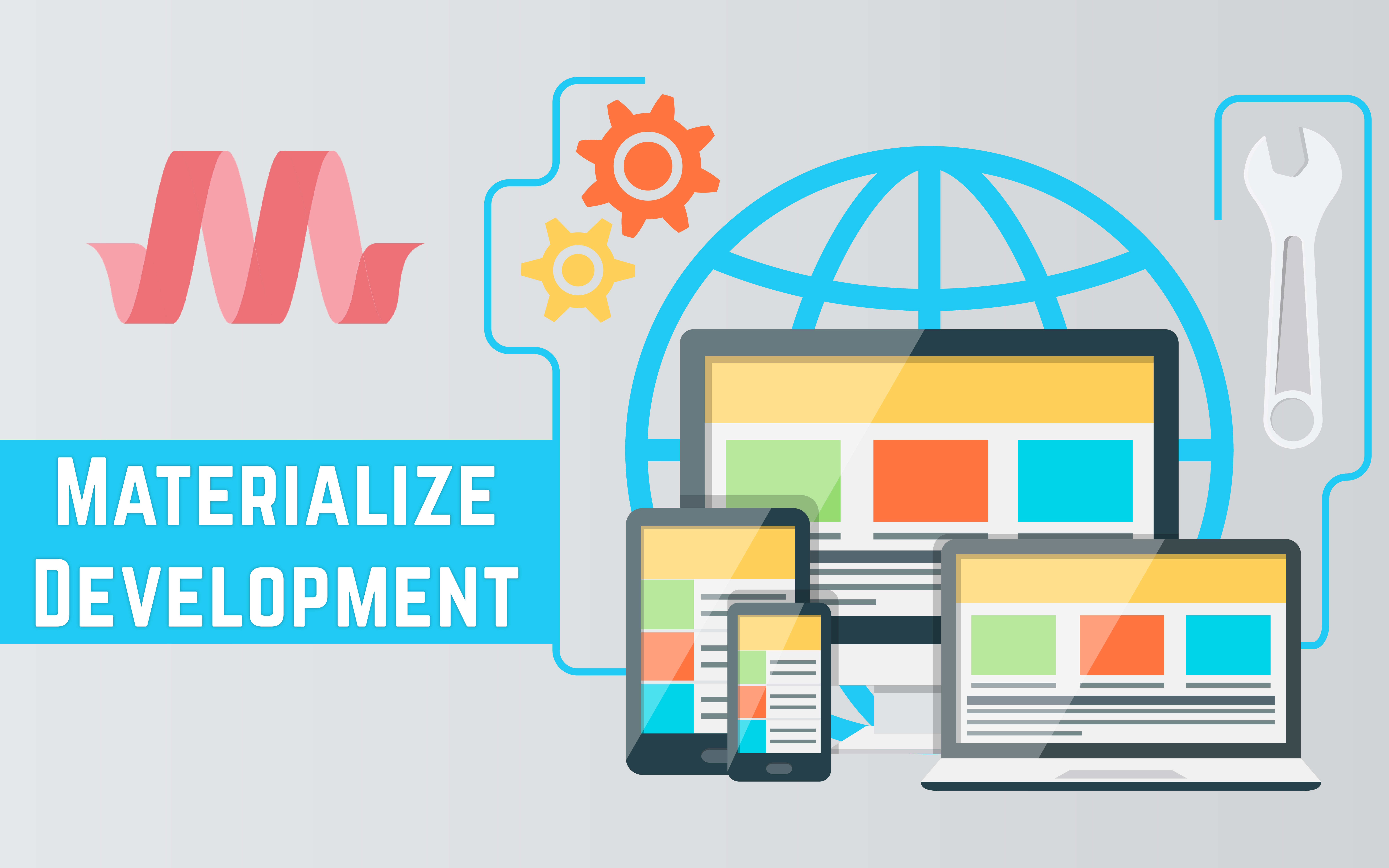
Materialize constitutes a wide UI component library, composed on CSS, HTML and CSS. Also goes by the name Material Design, it is a design language created by Google. As a popular language, it incorporates the features required for a successful design, promoting innovation and technology for designers. Materialize is celebrated as a successful platform among designers. It provides a platform where designers can create amazing web pages and apps, which facilitates a unified user experience in multiple platforms.
Apart from constructing remarkable, scalable and responsive web pages and apps, designers can also integrate contemporary features like:
- Browser Portability
- Grace Degradation
- Device Independency
Why Materialize?
| Supports torrential amount of features: | It comes with in-built responsive design offering superior compatibility with all popular browsers and devices. It includes specializes features and user interface controls. |
| Allows reusable web components: | Includes components which can be reused across multiple platforms without the rewriting codes. It saves your time and money without letting you compromise on quality. |
| Responsive Design: | Materialize has in-built responsive designing so that the website created using Materialize will redesign itself as per the device size. Materialize classes are created in such a way that the website can fit any screen size. |
| Extensive range of color palette: | With numerous colors to choose, you can develop sublime imagery by executing fascinating color coordination in your website. |
Your website is your identity and also a medium for you to establish an intense connection with your stakeholders.
We at iTreeni doesn’t create a website just for the sake of placing you in the online platform. Therefore, we always consider the current market demand and develop a responsive & easily-modifiable website.
Why We Make a Difference for Your Business?
| Why We Make a Difference for Your Business? | We consider your business model (Social media Model, Merchant Model, Subscription Model, Affiliate Model, Advertising Model etc.) and prepare a website within a reasonable budget. |
| Transparent Pricing: | Pay what we have been promised. We don’t surprise you by adding hidden charges in your bill. |
| SEO Friendly Design: | There is no point of a website if it’s not noticeable to your audiences. An SEO friendly design helps you boost your visibility on the internet. |
| User-friendly: | You can edit, modify and upgrade your website without requiring constant support of a developer. Our designs are friendly enough for people with a non-technical background. |
| Single-point of Contact: | Your call goes directly to the project manager. No need to waste your precious time by waiting in line for contacting the designated person. |
Let us assist you in estimating your business requirements. Contact Us or send mail at sales@itreeni.com